Duplication Centre

CD, DVD, Blu-ray duplication

01702 530 354

24 Hour Turnaround

Archive for the ‘Design’ Category

Printed Parts Are Important

Tuesday, September 4th, 2018

All of our customers are producing a CD,DVD or Blu-Ray to communicate Audio and/or Visual, Music, Spoken Word, Information or Performances to their audience/customers. This is the main event!

With a physical CD, DVD or Blu-Ray however there is another dimension/medium available to express visually in Word, Picture and Images through the use of printed covers and booklet inserts. This recruits yet another of our senses and gives an additional aesthetic dimension to your product. For most customers this is a really important feature of the duplication process and for many is not just the imparting of information, but another expression of art.

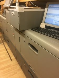
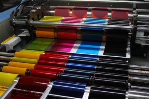
Our clients can spend a great deal of time designing artwork for their orders so with this in mind we invest in a State of the Art printer technology which is second to none for print production.

We only use the highest quality card and paper on all the associated printed parts that come with CD, DVD and Blu-Ray Production.

How often have you pulled out a CD/DVD booklet that is thin and shoddy quality? We know that you want your duplication order to be of a professional standard so we only use card that is 350gsm and 170gsm papers. These are good to handle and allow the print quality to show at its best. Your carefully planned project deserves no less than the highest quality printed parts and that is what we provide.

We also manage to remain Eco-friendly whilst maintaining this high quality by using FSC certified sustainable stock for our printing 🙂

Lightscribe Technology – is it as good as all the hype is making out?

Thursday, May 6th, 2010

Lightscribe technology - the new way to make pretty discs!

Some years ago, Hewlett Packard became increasingly frustrated with its own home-CD-printing software: It was a hassle to print out and stick labels on CDs and it was very easy to get it wrong! So their developers began to come up with a new plan; why not use a laser to etch the CD label onto the disc instead?

The technology to achieve this was developed, dubbed Lightscribe Technology, and software and etching devices were unleashed onto the market. Lightscribe has been a massive success so far, allowing consumers to produce professional-looking CD labels at home by etching labels onto discs rather than printing and sticking.

But how does this new technology work? Allow me to explain; First, there is the Lightscibe drive, a disc-drive which etches your CD label design onto your CD. To use one of these drives, you must have compatible media (Lightscribe-printable CDs are very clearly labelled and available on the internet with a quick search-engine check) and the appropriate software installed to your computer. Hook the Lightscribe drive up to your computer and away you go!

The drive itself works by using the same kind of laser that burns CDs to engrave an etched image of your CD label onto the front of your disc. However, it has a ‘control feature zone’ which not only allows it to take in the full dimensions of your disc, but also means that every time you insert the disc, it begins printing in the same place again. this means you can print multiple times on the same disc, adding a title or extra image if you wish. It is no problem if you forget something: You can always just insert it later on!

While this breakthrough is a marvelous development, it does come with some drawbacks; it takes a very long time to etch a CD label onto even one disc – up to thirty minutes, dependent on how complex your design is! – while printing and sticking usually takes between three and five. Also, while thermal and inkjet printing allow for variants in colour, Lightscribe is simply monotone.

However the quality of the CD label is guaranteed to be superb and the etching effect does look incredibly professional: Much more so than a CD marker pen!

And bear in mind that this is very new technology: Developers have a lot of time to work on improving the current model and fixing the problems that have occurred in it. And, as always, the more we as consumers invest in a product, the further the product will develop over time!n

How to Use Duplication Centre’s Artwork Creator

Sunday, April 4th, 2010

Duplcation Centre's artwork creator will help you make stunning CDs and DVDs

It can be very difficult to get a CD design which is right for your product: But, thankfully, with Duplication Centre’s new online Artwork Creator, you can design and make your own CD design! And, to help you even further on the way to getting the design you want, here are some helpful tips on how to use it…

To begin with, let us examine the basic screen. At the top, from left to right, are the options for a ‘New Design’, to ‘Load Design’, ‘Save Design’ or ‘Upload Image’ from your computer. Below is the ‘Clip Art Gallery’ at the top of which is a drop-down list allowing you to select which category of clip art you which to have displayed. Beside this is the ‘Text Tool’ and to the right of this is the colour chart which can be used to select the background colour. At the bottom of the screen is the ‘Workspace’ in which you create your image.

It is here that the first step in design occurs: Here you pick which aspect of the CD you are designing. You are given the choice to design a 4-page booklet for the insert, the CD/DVD body, a plain card for the insert, the inlay for a Jewel case, a DVD book or DVD wrap. Each option gives you a different space to design in, specifically measured to the design requirements of a CD: The CD body is the actual size of a CD body, the 4-page booklet, the correct dimensions for a 4-page booklet insert. These options are selected by pressing the option tabs at the top of the ‘Workspace’.

Within the workspace, different coloured lines mean different things: A red line indicates the edge of your product, though to allow for cutting errors, your image should go at least to the edge of the page. The light green lines indicate the space in which it safe to put important information. Between the red and green lines will be on your CD, but, again, due to cutting errors, it is not a wise plan to put important information so close to an edge which could potentially be cut off. Dark green lines indicate where the pages will fold.

It is also important to know that at the top of the ‘Workspace’, beneath the aspect option tabs, are two tabs. One says ‘Workspace’, the other, ‘Preview’. By selecting the preview tab, a new window opens with a full preview of your work. To get back to the main screen from the preview, simply close the new open window.

Once you have selected the part of the CD which you wish to design, it is time to select your background colour. Go to the right hand side of the page and find the background colour selector. You can either select one of the colours displayed or click the ‘More Colours’ button to open a new internal window which will allow you to select a colour from a chart. To get rid of it again, simply re-click the ‘More Colours’ button which will now say ‘Hide’. If you have a colour you know that you want already, simply click the ‘Enter Own Colour’ button and insert the hex code before clicking ‘Accept’.

After you have decided on your background colour, it is time to put an image onto your work. To do this you can either use one of the existing images by single-clicking on it in the ‘Artwork Gallery’ (middle, left-hand side of the screen) or upload your own. To do this, click the ‘Upload Image’ button at the very top of the screen. Then, select from your files and folders the image you wish to insert, before clicking ‘Select’. The image will then be uploaded into the workspace.

Once you have an image in the workspace, you can drag it around until it is in the correct position. You can also alter its size by bringing the mouse to the edge of the image until it turns into an arrow. Click and drag until the image is the size you want it. You can make it smaller or larger by doing this!

By inserting an image, you have made a new ‘Layer’. Each image has its own layer. To view the layers, look to the bar at the bottom right side of the screen, alongside the workspace. Drag and drop the layers higher or lower in the list to bring them forward or back. Aside from this, you can edit the brightness and opacity levels from here by selecting the layer then dragging the slider up or down on the corresponding scale in the layers toolbar. Rotation can be adjusted here, too, allowing you to twist and spin your image as much as you want.

The final thing in the design process is to insert the words you want. You could just have a title or you may want to print some lyrics inside your booklet. Whichever way, turn now to the ‘Text Tool’ which is situated near the top of the screen in between the ‘Clip Art Gallery’ and the ‘Background Colour’ selector. First, roll your mouse over the ‘Font’ button (Top left hand corner of the ‘Text Tool’) to decide which font you like. As your cursor scrolls over the font, a preview of it is temporarily shown in the Artwork Creator. Once you see a font you like, simply click on it to select it. Next, choose the size by selecting it from the drop-down list beside the ‘Font’ button. To select the justification, simply click either the right-hand orientation or the centralise buttons (top left corner of the group of icon-buttons in the top right corner of the ‘Text Tool’). Similarly, the button with the double-ended arrow going from side to side orients the text horizontally, as normal. The button with double-ended arrow going from top to bottom orients it vertically and the arrow going in a circle makes the text go in a circle. ‘Bold’, ‘Italics’ and ‘Underline buttons are directly beneath the orientation buttons and the final button in that group, which is a ‘T’ with a coloured block beside it, allows you to select the colour of the text you want. To add the text, simply click ‘Add Text’ and then drag the text to where you want it once it has appeared in the workspace. If you wish to edit the text once it has been inserted, simply double click it then edit the options in the ‘Text Tool’ space.

Lastly, to save your design, simply click the ‘Save Design’ button at the top of the screen. Click ‘Ok’ is a screen pops up, and the image you have created should save on your desktop in and ‘Artwork Creator’ folder. To load a previous design, click the ‘Load Design’ button (left of ‘Save Design’ button) then select the folder in which you previously stored the design you made. Then select the only version of the design which is not greyed out (file type ‘.prj’).

And if it all goes horribly wrong, just click the ‘New Design’ button in the top left corner of the screen which will give you a fresh canvas!

I hope this guide helps you to fill your design needs easily and effectively!

How To Get Your CD Artwork Designed

Sunday, April 4th, 2010

Attractive CD artwork means a disc which sells well!

Getting the right look for your CD can be a real challenge.  You want your product to look good and yet still appeal to the right consumer-group.  There are several different roads you can take to get your artwork designed, and by covering them in this articles, I hope to help you make up your mind which one is most suited to your needs.

Perhaps the highest quality design will come from hiring a professional designer to do the job for you.  It’s their livelihood so they’re sure to know what they are doing and will probably have much better software at their disposal to do it with than you will.  The design they come out with will be exactly what you ask for and they can work to a certain time-scale.  However, hiring a professional is perhaps not the most cost-effective way to get your CD artwork designed as they do charge for the hours they work on your design.  However, if you do want one it can save you a lot of your own time and they are not difficult to find:  Simply search in the ‘Yellow Pages’ or on an internet search engine.

The next option is to use an online or downloadable artwork creator.  My favourite is the Artwork Creator designed by Duplication Centre.  It’s very easy to use but still offers you many options for editing your image, without having to spend a lot of time learning how to use new software.  Of course, if you have a program such as ‘Photoshop’ you could always use that.

Though it can be very time consuming to design your CD artwork yourself, if you do decide to take this route, you then have the question of where to get the images you use in your artwork from.  You can take the photos yourself but be warned that unless photography is a hobby of yours, it can be difficult to get high-quality results.  So you could get them professionally taken, but remember that this costs a lot of money.  If you want a cost effective, fast way to acquire photos without having to take them yourself, you can always set up an iStockphoto account.  iStockphoto is a website designed to let you browse through literally thousands of photographs and buy them to use on your products royalty free.

I hope that these ideas help you to decide how best to design your CD artwork to the high quality you would expect and in the time frame you need!

CD Insert and Cover Layout Design Tips

Monday, January 4th, 2010

It's tricky to create a good CD design - so here are some tips to help you!

The design of your CD artwork will have a really massive effect on who buys it and what your consumers think of it. Way before they listen to your CD, they will probably see the cover on a shop shelf. A lot depends on them taking an initial liking to this image, and also to the insert or booklet and back cover. This is why it is so important to put lots of effort into making your CD artwork look appealing and attractive – and not just to any user, but to your selected market! So this article intends to gives some helpful tips and advice on how to make your CD look super!

To start, it helps to know what size your inserts need to be:

– The insert for the front is 4.75”x4.75”
– If you want to make a foldout, simply add an extra 4.75” of length onto the initial dimensions for the insert until you have the desired number of pages
– If you are making a booklet, it should be 9.5”x4.75” so that it can be folded in half. This can be repeated for as many pages as are needed in the booklet
– The back insert is 5.906” with 0.25” on either side for each spine x 4.625”

These are the standard sizes for a CD Jewel case however I would advise leaving a 0.25” ‘bleed’ around everything to make sure that you don’t get any nasty unintentional borders – these can look really unprofessional! A ‘bleed’ is a gap where the image overlaps outside the print area and it serves to prevent white patches around the edge of an image. Similarly, don’t forget to leave a 0.25” gap inside the image too, called a ‘safety’, making an area called the ‘live’ image, where you can be certain that no important bits will get chopped off!

As for what you put in the artwork, that is quite up to you, but it is a good idea to have important information accessible from the outside, i.e. on the front or back covers. For example, if you are making a music CD, it is a good idea to include the artist, album or single title, song names and record label in an easily visible place. But at the same time, don’t overload the cover with information which could be off-putting to many users. Sometimes simple is good! If you are making a booklet, you might want to put in some interesting information like an interview with the artist, lyrics or acknowledgments. Conversely, you could just have lots of really lovely pictures – it depends a lot on what you want the mood of the CD to be.

As for the imagery itself, try and make it as personal as you can, for instance if you’re making a mix CD for a friend perhaps include images of the two of you together! Obviously, if you are aiming at a wider audience try and define what would appeal to your market. For example, heavy metal music usually has very heavy, gothic artwork involving lots of blood, skulls and demons, while classical music tends to have calming scenery or renaissance paintings on the cover.

The same rules apply for choosing a font. For a more serious audience, try and select a serious font, for instance ‘Garmond’. Try not to pick anything that is too hard to read or very over-used – these will both put people picking up your product whether because they can’t understand it or whether because they dislike the cliche implied!

To pick up the mood of your CD, especially if it’s musical, it can be really beneficial to listen to it while you are working on the artwork: Professional graphic designers do it all the time to get their creative juices flowing! Also, try creating a few different images before you settle on one as sometimes the first idea you have is not necessarily the best and look at other artwork to see what else is being done for inspiration. If you’re working on a computer, it is also worthwhile to zoom right out sometimes and take a look at the cover as a whole: This will give you a much better idea of what it will look like once it’s printed up!

Be especially careful when designing your spine – it may look like a small thing but it is very easy to mess up if you don’t leave the proper bleeds either side of it! I would suggest at least two millimetres to compensate for any inaccuracy during the guillotining process, ensuring the writing doesn’t get cut in half or left off altogether! It’s usually a good idea to fit as much information as you can on here. With a music CD it’s normally the band name, record label and album or single title.

It’s also quite important to keep your packaging in mind: The artwork will have to fit into it. Consider whether you wish to make a booklet, fold-out, single sleeve or whether you want to do something extra special. The band Tool recently brought out a very individual album with stereoscopic viewing lenses inside the booklet which made all the images appear in 3D! Their fans loved it and it got them a lot of publicity! Remember though, when brainstorming these awesome ideas, to always consider the cost, too. Sometimes what seems like a great plan is not practically the best thing to do.

It’s also worth bearing in mind – and this is particularly appropriate for music CDs – that in this technological age, many CDs get copied to computer CD libraries where the CD artwork can be viewed when the song is played. It is worth remembering that any special colours, or ‘spot’ colours, which cannot be made with the standard computer colour displays will not show up! These include fluorescent and metallic colours. Though these look very nice on the shelf, you may want to make a different set of artwork that is computer-friendly, too.

A particularly useful website for helping to design and create original and attractive CD covers, inserts and body-prints is offered here for free! You can upload your own images, add text and know for sure that your layout is exactly what is needed!

I hope this helps get your ideas-hat on and gives some practical advice, too! Good luck with all your CD artwork designing! Remember to keep your intended user in mind and never stray far from the CD content and you’ll be well on your way to creating some great CD artwork!

Different kinds of CD and DVD cases

Monday, January 4th, 2010

There are lots of different CD and DVD cases

Nowadays, when issuing a CD or DVD onto the consumer market, it has become almost as important what the disc looks like and how it is packaged as to what its actual contents are. That is why it is so important to choose the right CD or DVD packaging for your product! And as the market is flooded with so many different kinds of CD and DVD cases you would be forgiven for getting confused or finding it hard to make a decision. This article is here to help! In it, I shall discuss the various most common types of CD and DVD case, their pros and cons and any particularly distinctive features each one could offer, helping you make up your mind on how you want your CD or DVD to look.

Though there is some crossover between CD and DVD cases but mostly they are quite different: CD cases tend to be smaller, designed to be almost the exact size of the disc itself. However, DVD cases tend to be the size of a thin, A5 book to accommodate extra booklets and information. I shall start by explaining the main types of CD case before going on to DVD cases.

The most common kind of CD case is the Jewel Case, so named because their creator, somewhat romantically, said they picked up the light like jewels. These cases are made from transparent plastic, comprised of a lid supported by two arms, in turn attached to the base. The base is made from the remaining two pieces, one is plain and forms the back of the case, the other suspends the CD, holding onto it with small teeth which grip the central hole of the disc. With these cases, there is a lot of scope for CD artwork and information: It can be in an insert or booklet slid into the front cover and held there by four or six small plastic teeth and also on an insert in the back, between the two components, which makes it very aesthetically pleasing. Not only that, but they will also protect the CD for much longer than some of the other, flimsier cases, thus being ideal for use in the music or film industry. There are also variations on the case, making it double thickness with extra hinged trays, so it can carry two, four or even six CDs. To add to this, so long as the inlays are all in place, the disc is almost completely protected from UV damage!

So, these cases are pretty, versatile and generally resilient: What is the problem? Well, the smaller parts (the teeth and arms) are liable to snapping which can render the holder useless. Aside from this, the cases are environmentally quite unfriendly as they are difficult to recycle and their creation produces lots of carbon dioxide and toxic fumes. They are also quite bulky and can cost quite a lot in comparison to some other cases. There have been some attempts to address these issues: Some cases have been fitted with tougher, black plastic backs to strengthen the case, but this is less aesthetically pleasing than the clear backs with artwork. Also, some cases have been made slimline, with only one component making the back, but again this compromises on aesthetics because the backing artwork is eliminated.

By far the most space saving case for single CDs is the simple ‘sleeve’. These sleeves are made from either a thin, flimsy plastic known in the business as ‘tyvek’ or out of paper or card. The tyvek sleeves will protect the disc from water and other spillages where the paper ones won’t. But the paper sleeves are very environmentally friendly; recyclable and also able to be made from re-used components. However, in both cases, the sleeves are not strong and don’t serve to stop the CD from snapping or getting crushed and while the paper sleeves protect from UV damage, the plastic ones, unless they have inlays, are next to useless for this! So, perhaps not the best long term solution! However, in the short term, attractive inlays can be inserted into the plastic sleeves either side of the disc, while the paper sleeves are very printable and can even be laminated for a more professional finish.

In keeping with the theme of paper sleeves, cases made from card are becoming increasingly popular. The market is full of new an innovative ways to display your CD in ever more eco-friendly packaging; from the highly acclaimed and regularly used DigiPack, which boasts only one component of plastic, to the origami-like Jake Case which is impressively folded around the disc to create an original and very aesthetically pleasing look. There is even the environmentally friendly WowWallet which is entirely made from FSC approved paper and cardboard. While these paper and card cases are ethically very sound and have every surface available for artwork and design, they are still less resilient than the plastic cases. They are susceptible to spillages, with the slight exception of the laminated DigiPak, and can be torn and battered. For this reason, they are more often used for advertisement or demo discs rather than a long term product which a consumer is paying for.

Going ever more green, the most eco-friendly of the CD cases is the Soft or Green Case. These are made from the recycled discs themselves and are known for their opaque quality. However, because of this opaqueness, artwork is reduced to a minimum, and they are also not very good protection against the disc snapping as the CD cases can easily be bent back on themselves.

A Table Demonstrating the Different Types of CD and DVD Case

Moving on to DVD cases, these are mainly being kept to book-sized plastic boxes called Keep Cases at the moment, which are akin to Jewel Cases, but have only one component on the back and are usually made from black plastic, though sometimes it is also clear or, very rarely, blue. A thin clear plastic cover allows for a colourful cover to be inserted on the outside and inside, two teeth make a holder for an information booklet. These are by far the most popular cases as, like the Jewel Case, they are resilient and leave plenty of options for artwork. Sets of DVDs are also released in Box Sets, storing two or more Keep Cases together in a cardboard box. However, the Keep Cases are quite expensive, thus it has not been unknown, especially in the advertising world, to use Tyvek or paper sleeves to distribute DVDs.

When it comes to bulk packaging, CDs and DVDs are very similar, coming mainly in Cake Boxes. A Cake Box piles discs one on top of the other on a spindle, with one large cylindrical plastic cover to protect them all. However some of the cheaper CDs can also come in Blister Packs, like pharmaceutical pills, or shrink wrapped in plastic. Normally only blank discs are sold in this manner and it is advisable in these cases to at least buy sleeves to protect your discs once you have burnt onto them.

Of course this is a vast generalisation on the different kinds of CD and DVD case available – there are always exceptions to the rule, for example many special limited edition or anniversary albums or films are brought out in unique cases which are made from metal or even wood. Some albums are released with pop-up artwork and some advertisement discs have oddly shaped booklets to try and draw attention to them. While these are all excellent marketing ideas, they do come at a hefty price and I would advise only going down the specialist route if you know it will be worth it for you in the log run – whether for profit or artistic achievement!

I hope this article has proved useful and helped you to make your mind up about which CD case is best suited to your needs, whether they be to produce an attractive product, create a long term data storage device or simply learn which case would be most kind to the planet!

Differences between disc printing methods – which one is right for you?

Monday, January 4th, 2010

It can be difficult to decide which CD printing method you want to use

It is very important to have labels on your CDs: This is not only so other people know which way up it is supposed to go into the machine, but also for a beautiful and professional-looking product. But the problem is, there are lots of different ways of disc printing so deciding which one is most suitable to your needs can be tricky! This article is aimed at helping you to figure out which one you want to use!

To start, there are four main techniques for printing CD labels: Lithographic, or offset, printing; thermal transfer printing; silkscreen printing; and inkjet printing. Each one has it own pros and cons.

Lithographic CD printing, or offset printing, involves putting your CD artwork onto a processing plate either through simply printing it from a computer or using photographic negatives and a chemical treatment. The plate is then ‘offset’, or imposed, onto a rubber blanket cylinder which applies it to the surface of the CD or DVD. This process looks incredibly good, and allows for high-quality photographic images and small text to be printed onto your CD. However disc printing in this way is only avaliable if you are replicating rather than duplicating discs as it is part of a whole manufacturing process. It can take up to ten days for the entire process to complete, thus is much less speedy than other printing methods. It is, however, a very good printing option if you need more than 1,000 discs to be made as large batches of discs are usually replicated anyway to save money. But, even taking this into account, Lithographic printing is not the cheapest option by any means.

A Table Showing the Different Methods for Printing CD Labels

When it comes to thermal transfer disc printing, each colour is placed separately onto a transfer ribbon which is then applied beneath a heated print-head. It seals the disc so that the label is waterproof and smudge free. Because the

images are taken directly from a computer, the process is very fast. It is cost-effective in small runs and also looks very good – the print quality is even better than with lithograph disc printing! (This is not to be confused with thermal printing which uses basically the same technique but can use only one colour and is slightly less precise in finish – though it is even faster and cheaper!) Both thermal and thermal transfer printing do not allow you to print right up to the edge of the disc and thermal transfer printing will quite often have to have a white base to print the other colours on top of.

Next, silkscreen printing, or simply ‘screen’ printing, allows disc printing by passing ink through a monofiliment screen. Each colour is put on separately, a different film acting as a stencil over the screen each time. This technique, while by far the cheapest for large runs of disc printing, can leave a grainy effect around colour gradients and text. Nevertheless it is perfectly acceptable for simple designs which use only a few colours. Be warned that the more colours you use with this technique, the less the quality of the image will be!

Lastly, using inkjet printing you can achieve a very high quality finish. This process involves simply printing straight onto a specially prepared disc, then covering it with a UV-resistant laquer so the image will not fade or get scratched. This is a very good method of printing, however it does tend to be pricier for large runs of disc printing, as the price is fixed and does not drop the larger the order becomes. In this way, it can be more economical to is silkscreen or lithographic printing methods.

I hope that this article has helped you make up your mind which printing method is right for your needs and good luck with your disc printing! Remember, if you can stretch the budget, it’s better to have a good-looking disc as it will attract more attention and consumers will like it better!

Duplication Centre Resource Centre is proudly powered by WordPress | Entries (RSS) | Comments (RSS) | 35 queries. 0.039 seconds.